Storm Tracker
Background and Class Context
A class project for STAT 133, Concepts in Computing with Data. The class premise was centered around understanding computational data analysis with a focus on key principles: understanding data formats and manipulation techniques (wrangling, reshaping, tidying), producing insightful visualizations, applying fundamental programming concepts for data analysis, and leveraging computational tools to streamline workflows, execute the data analysis cycle, and enhance reporting through dynamic documents and web apps emotions play a role in the world of digital design
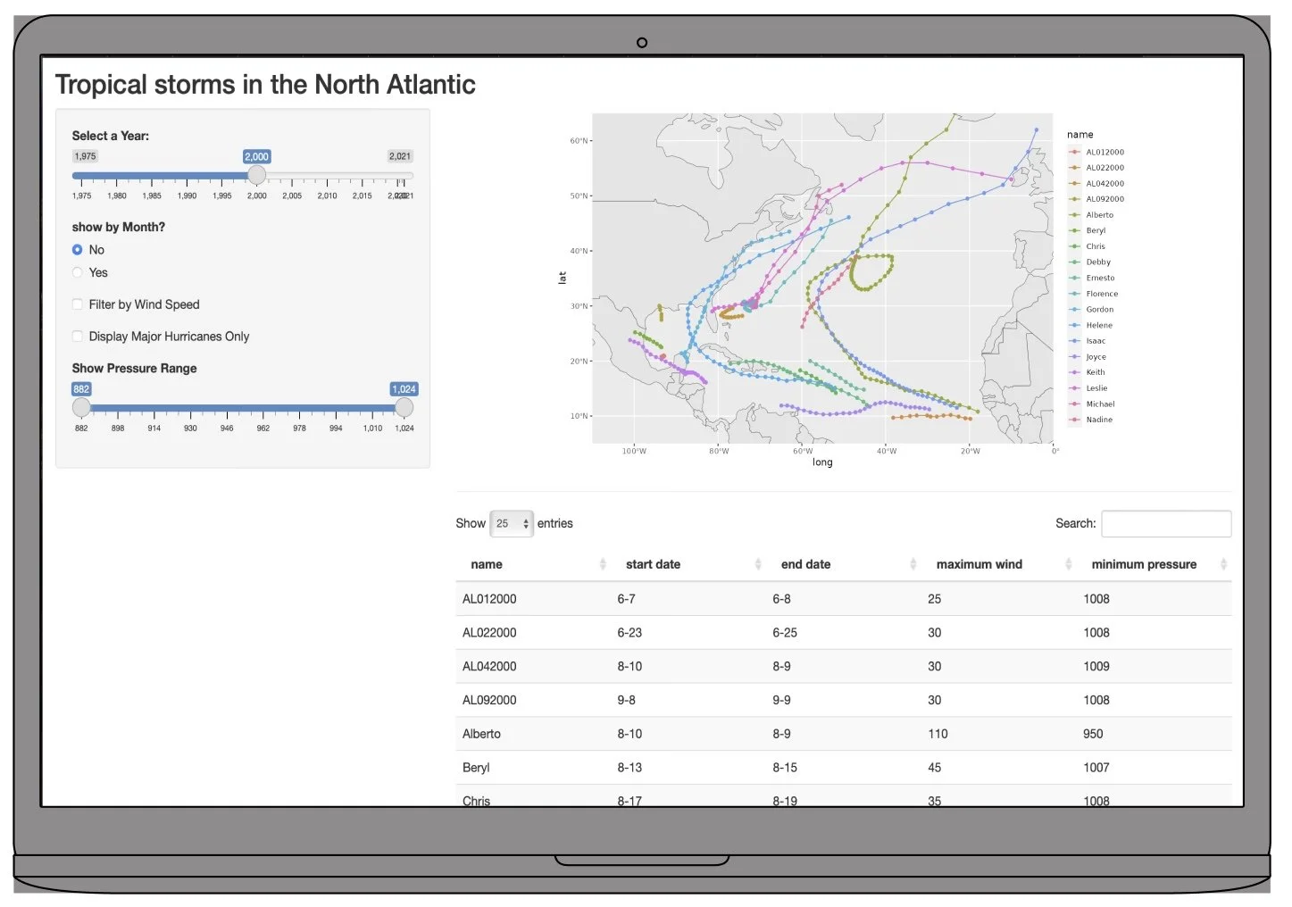
I developed a Shiny app at UC Berkeley to visualize the trajectories of North Atlantic tropical cyclones from 1975 to 2021. The app uses various interactive filters to sort storms by year, month, and wind speed, with an option to highlight major hurricanes exclusively. Built using R's dplyr for data manipulation and ggplot2 for dynamic mapping, the app provides an intuitive and comprehensive tool for exploring storm data. Published on shinyapps.io, this project highlights my ability to design engaging and insightful data visualizations.
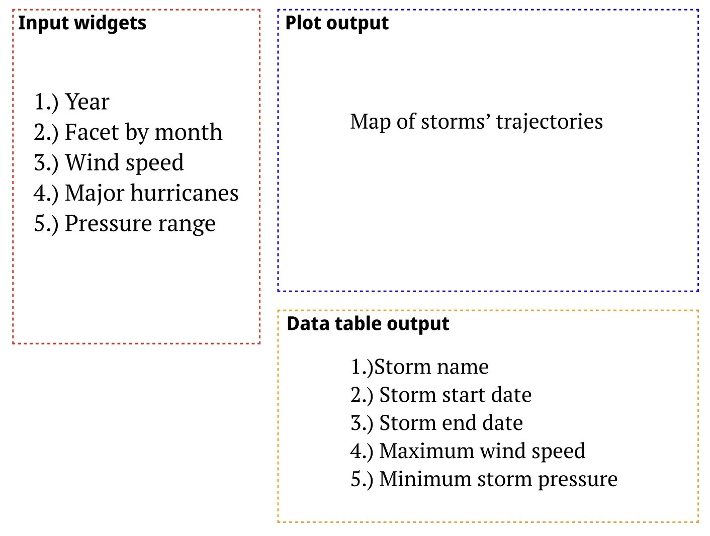
App Layout and Features
Final Product