Retirement Visualizer
Background and Class Context
A class project for STAT 133, Concepts in Computing with Data. The class premise was centered around understanding computational data analysis with a focus on key principles: understanding data formats and manipulation techniques (wrangling, reshaping, tidying), producing insightful visualizations, applying fundamental programming concepts for data analysis, and leveraging computational tools to streamline workflows, execute the data analysis cycle, and enhance reporting through dynamic documents and web apps emotions play a role in the world of digital design
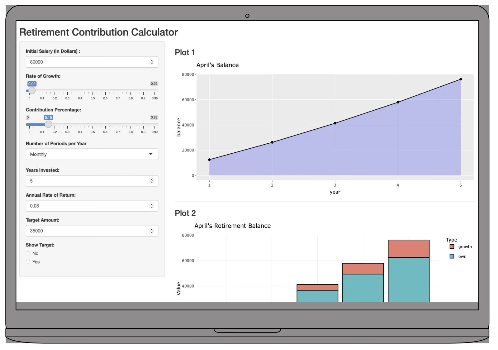
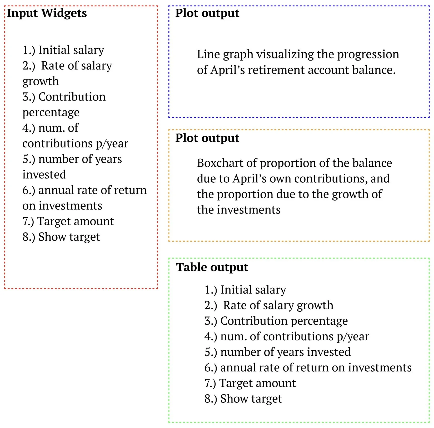
At UC Berkeley, I created a Shiny app designed to project the growth of savings in an employer retirement plan. The idea is to create a calculator to see how much money you could accumulate in your employer retirement plan (or other similar retirement account) over time by making periodic contributions from each paycheck. This app allows users to input variables such as initial salary, contribution percentage, and expected annual return to dynamically visualize potential future balances. It features an intuitive interface, complex financial calculations, and interactive visualizations, aiding users in personal financial planning.
App Layout and Features
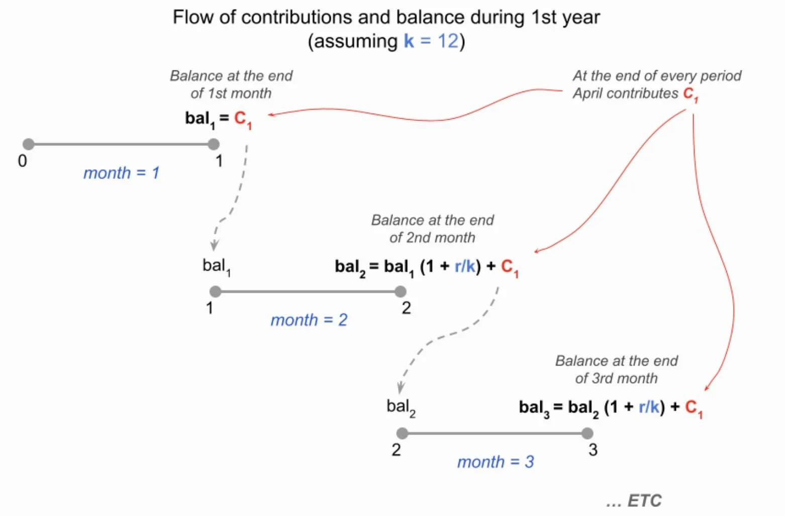
First Year Contributions
During the first year, April contributes a total of towards her retirement plan. Because the number of periods is 12, this means that at the end of each month she contributes .
The following diagram illustrates the flow of periodic contributions, and the resulting balance at the end of each period.
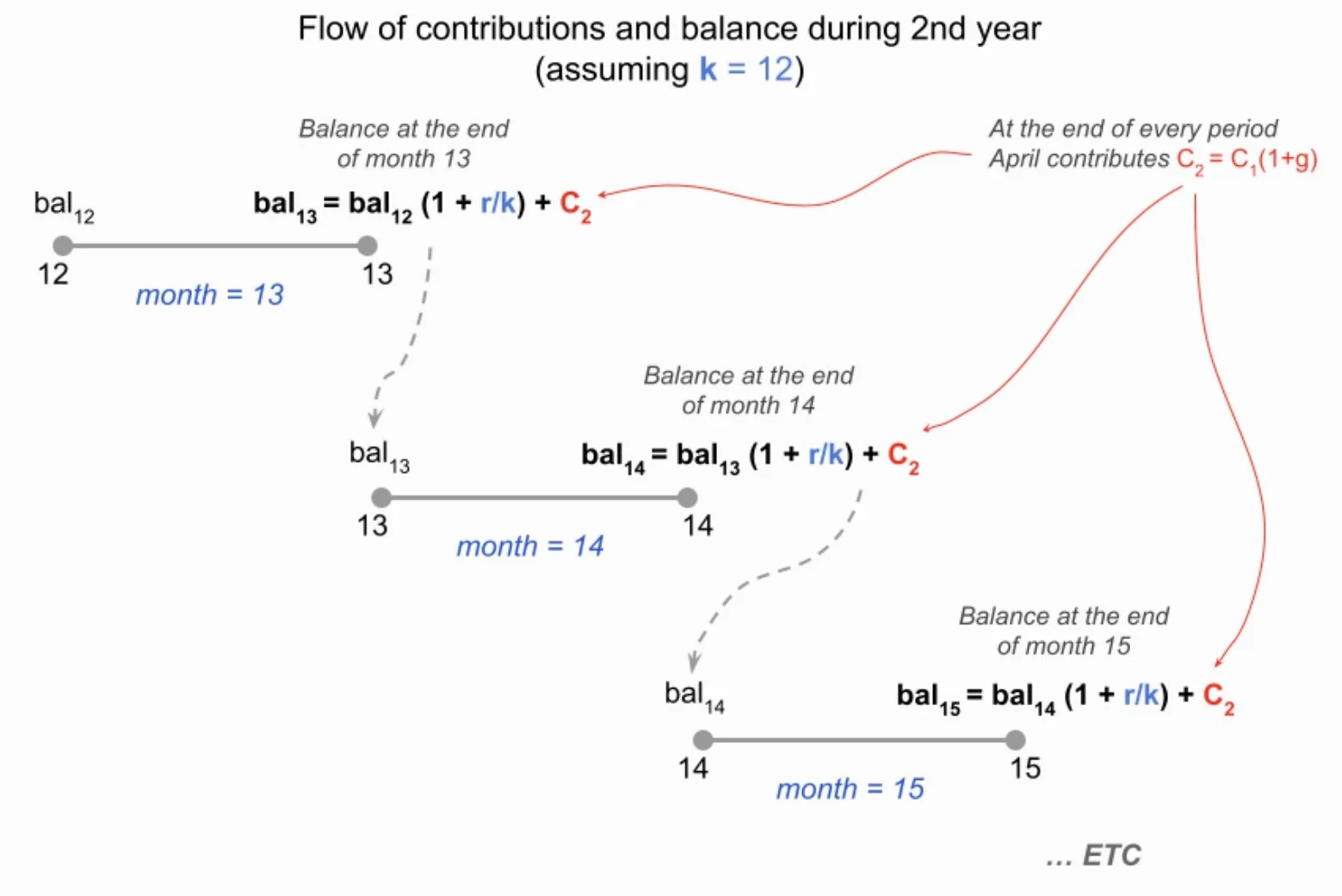
Second Year Contributions
In year 2, April will grow her salary by = 2%, having an annual salary of $81600. During that second year, she will continue to save 15% of her salary, making a total contribution of $12240 to her retirement plan. This means that at the end of each month she contributes: $12240 / 12 = $1020.
Final Product